Finding out if their website complies with accessibility standards is the main reason why most people launch a WCAG accessibility checker. Perhaps a compliance deadline is drawing near. Perhaps they want to stay out of trouble after hearing about lawsuits. Perhaps they truly want to make their website accessible to all users.
But what surprises people, though, is that a WCAG analyzer ultimately uncovers issues that extend far beyond legal compliance or disabilities. These tools spotlight issues affecting every single person who visits your site, whether they use assistive technology or not.
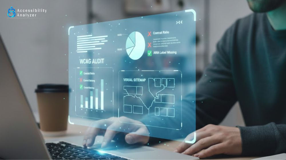
Let’s look at the unexpected issues that show up in accessibility scans and why they matter more than you might think.
Your Mobile Experience Is Actually Broken
This surprises people all the time. Someone runs a WCAG accessibility checker expecting to find screen reader issues or keyboard problems. Instead, they discover their mobile site is a mess.
How does this happen? Text sizing requirements. WCAG requires text to be readable without zooming. When sites fail this test, it usually means the mobile experience is poor for everyone, not just people with vision impairments.
Those tiny buttons that are impossible to tap? The WCAG analyzer flags them as too small for people with motor challenges. But really, they’re too small for anyone trying to hit them with their thumb on a moving bus.
Text that forces constant pinching and zooming? The scan catches it because it breaks resizing rules. But this frustrates every mobile user, not just users with disabilities.
Fixing these “accessibility” problems improves mobile for everyone. Bigger tap targets. Text that’s actually readable. Layouts that don’t break on small screens. The WCAG accessibility checker just delivered a complete mobile audit without even trying.
Your Content Organization Makes No Sense
Headings help screen reader users navigate the page, and so a WCAG accessibility checker examines heading structure (how H1, H2, and H3 tags are used across your site). But when the tool flags heading problems, it’s actually revealing that your content organization is messy for everyone.
If you are jumping from H1 to H4, using headings just to make text bigger without thinking about structure, it becomes extremely confusing for every reader, not just people using assistive tech.
Having multiple H1 tags on the same page is not just an accessibility issue; search engines don’t like it either. Google uses heading structure to understand what pages are about. Messy headings can mean lower rankings.
The WCAG analyzer basically audits your content structure and reveals whether pages make logical sense. Most website owners never think about heading hierarchy until a scan points out the problems.
Your Forms Are Confusing Everyone
Form issues show up in almost every accessibility scan. Missing labels. Vague instructions. Error messages that don’t help. The WCAG accessibility checker flags these for assistive technology users.
But think about it: if a form confuses assistive tech, it’s definitely confusing regular users too.
Ever filled out a form and had no idea what goes in a particular field? That’s a labeling problem. Ever hit submit and gotten a generic error with no hint about what went wrong? That’s poor error handling. Ever just given up on a form because it was too frustrating? These are exactly what accessibility scans catch.
When the WCAG accessibility checker says forms need better labels, it’s really saying the forms are unclear for everyone. When it flags missing error messages, it’s pointing at usability problems that hurt conversion rates.
Fixing forms for accessibility means fixing them for everyone. Clearer labels. Helpful error messages. Tab order that makes sense. Instructions that actually guide instead of confuse. The result is more people actually completing your forms.
Your Color Choices Hurt Readability
Color contrast failures show up constantly in WCAG accessibility checker scans. The tool measures whether text stands out enough from its background.
These standards exist for people with low vision or color blindness. But poor contrast bothers everyone. Light gray text on white? Hard to read for anyone, especially outdoors on a phone.
Here’s the thing: you’ve probably been squinting at your own site. You designed it, got used to it, and stopped noticing how difficult it is to read. The scan points out what your visitors deal with every day.
Better contrast for accessibility means better readability for everyone. In bright light. On budget monitors. On phones with smudged screens. For people over 40 whose vision isn’t what it used to be.
The WCAG analyzer is basically performing a readability check. When it flags contrast problems, it’s saying, “People are working too hard to read this.” That’s bad for everyone, not just people with disabilities.
Your Images Tell You Nothing
Missing alt text is probably the most common issue in accessibility scans. Every image needs a description for screen readers. The WCAG accessibility checker flags every single one that’s missing alt text.
But here’s what happens: when people sit down to add all that alt text, they realize they’ve never actually thought about what their images are doing.
That generic stock photo on the homepage? Writing alt text forces the question: what is this even communicating to visitors? That chart or graph? Trying to describe it reveals whether it’s actually useful or just decoration.
Sometimes this process shows that images aren’t adding any value. They’re just filler. Other times, it becomes clear that important information only exists in images, which means many people miss it entirely: anyone who can’t see images or anyone on a slow connection where images don’t load.
The WCAG analyzer starts as an accessibility tool but becomes a content audit. It forces you to think about whether images serve a real purpose. Many sites end up not just adding alt text but completely rethinking their image strategy.
Your Navigation Is More Complicated Than It Needs to Be
Keyboard navigation testing is central to what any WCAG accessibility checker does. Can someone navigate the entire site using just the Tab key? Can they reach everything they need to? Does the tab order actually make sense?
When these tests fail, they usually reveal navigation that’s overcomplicated for everyone. Dropdown menus nested five levels deep. Menus that require precise mouse hovering. Important buttons are buried in odd places.
If keyboard-only users can’t figure out the navigation, mouse users probably struggle too. It might technically work, but it takes more effort than it should.
The WCAG analyzer exposes navigation friction affecting all users. Making navigation work for keyboard users means simplifying it for everyone. Fewer clicks to important pages. Menus that make more sense. Clearer paths through the site.
Your Writing Is Harder to Understand Than Necessary
Some WCAG accessibility checkers analyze how complex the writing is. WCAG guidelines suggest keeping content as clear and simple as possible for people with cognitive challenges.
When tools analyze reading level, they often find writing that’s more complicated than it needs to be. Unnecessary jargon. Sentences that could be half as long. Paragraphs that go on too long.
This isn’t only about cognitive accessibility. Complex writing reduces understanding for everyone. People skim web content. They read on their phones while waiting in line. They’re usually doing multiple things at once. Simpler writing works better in all these situations.
Running content through accessibility checks often leads to clearer, tighter writing across the board. Shorter sentences. Simpler words where they work just as well. Better paragraph breaks. Getting to the point faster.
The WCAG analyzer becomes an editing tool that improves communication for your entire audience.
Your Links Don’t Tell People Where They’re Going
Link text gets heavy scrutiny in accessibility scanning. The WCAG accessibility checker flags vague links like “click here,” “read more,” or “learn more” because screen reader users often jump from link to link.
But vague links hurt everyone. They make scanning content harder. They create confusion about where links actually lead. They make pages frustrating to use.
Descriptive links help all users. Instead of “click here for services,” saying “view our web design services” tells everyone what to expect. Instead of five different “read more” links, specific descriptions let people choose what interests them.
The WCAG analyzer reveals poor information design that hurts user experience broadly. Better link text for accessibility improves navigation and clarity for every visitor.
Your Videos Are Missing Context
Video accessibility goes beyond captions for deaf users. The WCAG accessibility checker also verifies whether videos have descriptions or transcripts.
When these are missing, it reveals something bigger: important information is locked inside the video format. Anyone who can’t watch videos right now, at work, on the train, with limited data, or just prefers to read can’t get that information.
Adding transcripts for accessibility means offering content in multiple formats. Some people prefer reading to watching. Some want to skim quickly. Some need to search for specific details. Transcripts serve all these needs.
The WCAG analyzer points out when content gets unnecessarily restricted to one format and pushes toward more flexible delivery that works for different preferences.
Final Thoughts
Running a WCAG accessibility checker expecting just accessibility issues is like going to the doctor for one thing and discovering several other problems that need attention. The tool aims to verify accessibility compliance but ends up revealing much more. These aren’t just accessibility concerns; they’re user experience problems affecting everyone who visits your site. People with disabilities experience the same friction that everyone else does. They just feel it more intensely.
That’s why accessibility work has such a broad impact. Fixing issues for people with disabilities simultaneously fixes issues for people squinting at phones in sunlight, people on spotty connections, people who are distracted or multitasking, older users, non-native speakers, and countless others in different situations.
The WCAG accessibility checker becomes a comprehensive site quality check that reveals issues across multiple areas. It’s checking accessibility, but in the process, it evaluates usability, readability, performance, content quality, and overall design.