So there’s this thing about website accessibility. Everyone knows it’s important. Lots of people bookmark articles about it. But most never actually run their site through a website accessibility tool. Why? There’s this nagging worry about what they’ll find. Will it be a disaster? Will everything need rebuilding? Will it take hours just to understand the results? Let’s walk through what actually happens when someone takes that first step.
That Moment Before Clicking “Scan”
Here’s something nobody talks about: that pause right before running the scan. The tool is open, the website URL is in the box, and the cursor hovers over the button. There’s this weird mix of curiosity and dread. Part of wanting to know. Part of really not wanting to know.
Then the button gets clicked. The tool starts working. It usually takes anywhere from a few seconds to a couple of minutes, depending on site size. Just sitting there watching the progress bar, maybe refreshing coffee, wondering what’s about to appear. This is totally normal. Everyone feels this way before their first scan with a website accessibility checker. That nervous moment is universal.
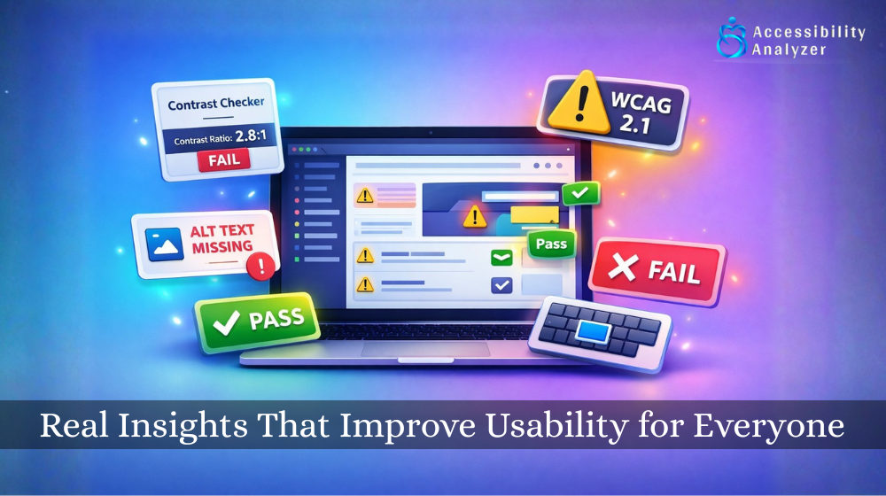
The Results Page Looks Overwhelming at First
The scan finishes. The results page loads. And wow, there’s a lot of red on the screen. The first reaction is usually something like “Oh no” or “There’s no way all of these are real problems.” The tool might show 50 issues, or 100, or even more. The numbers look scary.
But the thing is, this happens to everyone. Nobody runs their first website accessibility tool scan and gets a perfect score. Not small business sites, not big company sites, not even sites built by professional agencies. The sheer number of issues doesn’t mean the site is terrible. It means the tool is thorough and checks for lots of different things.
The Same Issue Shows Up Over and Over
Looking through the results, patterns start to appear. Maybe “missing alt text” shows up 30 times. Or “color contrast insufficient” appears on every page. This is actually good news. It means there aren’t 100 different problems to learn about. There might be five or six types of issues that repeat across the site.
That image alt text problem? Once someone understands how to fix it on one image, they can fix it on all of them. The color contrast issue? Change the stylesheet in a few places, and dozens of flagged items disappear.
When using a website accessibility tool, the results might look massive at first. But when half of them turn out to be the same issue repeated, it suddenly feels way more manageable.
Some Results Make Perfect Sense
Scrolling through, certain issues just click immediately. “Oh yeah, that definitely needs fixing.” Missing image descriptions? It’s easy to see why that’s a problem. Form fields without labels? Makes sense that screen readers would struggle. Text that’s too light to read easily? Anyone might have squinted at it.
These are the “no-brainer” fixes. The reasoning is clear immediately. There’s no confusion about whether this is a real issue or just the tool being picky. These clear, obvious problems make great starting points. They’re easy to understand, and there’s motivation to address them right away.
Other Results Are Completely Confusing
Then there are issues that make absolutely no sense. The website accessibility tool flags something with a technical explanation that might as well be in another language. “ARIA label not properly associated.” “Landmark region not defined.” “Focus order not logical.” Reading the description doesn’t help much either.
This is completely normal. Accessibility has technical aspects that aren’t intuitive without development knowledge. This shouldn’t be discouraging. What most people do is they skip the confusing stuff for now and focus on what makes sense. Later, when the easy fixes are done, they either research the technical issues or get help from someone who knows more. Understanding everything immediately isn’t necessary. Starting with what makes sense is perfectly fine.
Some Findings Seem Wrong
At some point during the scan results review, the thought comes up: “That’s not really a problem though.” Maybe the tool flags color contrast, but the text seems perfectly readable. Or it complains about the heading structure, but the pages make perfect sense. Or it says a link isn’t descriptive enough, but it appears clear in context.
This happens with every website accessibility checker. Not every single finding will seem valid at first. The website accessibility tool checks against established standards and looks at sites the way assistive technology sees them. What seems fine from one perspective might genuinely be a barrier for someone using a screen reader or dealing with vision issues.
Everything doesn’t need to be fixed immediately, but issues shouldn’t be dismissed just because they don’t seem like problems from a typical user’s perspective. Sometimes the tool catches things that can’t be experienced firsthand.
Quick Wins Appear Immediately
Reviewing the results from the website accessibility tool reveals problems that can be fixed immediately without technical help. Image missing a description? That takes two minutes to add. Link text says “click here” instead of something useful? Change it right now. Video without captions? Those can be added today. These quick wins feel great. The site improves while still looking at scan results. The problem count starts going down. Progress feels real. Most people end up fixing 10-20 issues in their first session, just by tackling the simple stuff.
Some Things Need Professional Help
Then there are issues that can’t be self-fixed. Keyboard navigation problems. Missing focus indicators. Complex form errors. Structural issues with page layout. These need someone who understands code. For sites built without technical expertise, this is where hiring help becomes necessary. For those with developers, this is what gets sent their way.
Most website owners can’t fix every accessibility issue on their own. The important thing is identifying the problems so it’s clear what needs professional attention. The website accessibility tool provides a clear list to hand off to whoever handles the technical fixes.
Priority Levels Start Making Sense
After the initial shock of seeing all those issues, something helpful becomes clear: not everything is equally urgent. The website accessibility tool usually labels problems as critical, serious, or minor.
Critical issues are the showstoppers, as they are the things that completely block someone from using part of the site. Maybe a form that’s impossible to submit with a keyboard. Or images containing important information but no description at all. Serious issues make things difficult, but not impossible. Minor issues are more like polish; they improve the experience but aren’t blocking anyone entirely.
This priority system helps create a game plan. Start with critical problems that affect the most people. Move to serious issues next. Handle minor stuff when there’s time. The tool basically creates a roadmap, which makes the whole process less overwhelming and more actionable.
Websites Start Looking Different
Something interesting happens after that first scan. Accessibility problems become noticeable everywhere. Browsing other websites brings thoughts like “Wow, that color contrast is terrible” or “These images definitely don’t have alt text.”
Adding new content means remembering to include descriptions. Choosing colors means checking contrast before committing. Using a website accessibility tool changes how web design is perceived. Awareness increases. Problems get caught before they become problems.
This awareness is probably the biggest benefit of running that first scan. It’s not just about fixing the current site; it’s about building better habits going forward.
The Wait Seems Silly in Retrospect
By the end of the first experience with a website accessibility tool, most people have the same thought: “That wasn’t nearly as bad as expected.” Yes, problems were found. Yes, some stuff is confusing. Yes, there’s work to do. But it wasn’t the nightmare scenario that got built up mentally.
There’s a clear list of issues. Some have already been fixed. It’s clear what needs help from others. There’s more control over the website’s accessibility than an hour ago. The anticipation was worse than the reality.
Future Scans Get Planned
After the first scan, there’s a need to do it again. Not immediately; time is needed to fix stuff first. But in a few weeks or months, after addressing some issues and adding new content, another scan happens to check progress.
It becomes part of website maintenance, like checking traffic or updating content. Scan, fix what’s possible, and improve a little at a time. The website accessibility tool stops being this scary unknown thing and becomes just another tool for keeping the site working well.
Final Thoughts
So what actually happens when using a website accessibility tool? The initial nerves get overcome, the problems become visible, fixes happen where possible, and a plan forms for the rest.
It’s not as overwhelming as feared. It’s not as complicated as it sounds. And it’s definitely not something that needs putting off any longer. The hardest part is clicking that scan button for the first time. After that, it’s just working through the list at a comfortable pace.
Most websites have accessibility issues. Almost every site out there does. The difference is knowing what they are and how to fix them.